
 copy small round.png)
Disjecta Membra
This page contains material that I think others might find useful but has not / does not fit within a longer narrative, such as a paper. My preferred language for plotting and data manipulation is R.
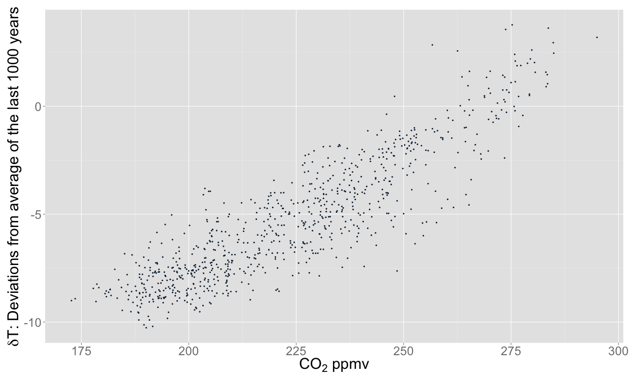
Graph of CO2 v Temperature over the last 800k years
The source data for the graph on my home page was downloaded from the EPICA data archive. The data I needed had to be extracted from the raw data to produce the graph. My copies of the raw data are here: CO2, Temperature. If you only want the data I used then try: CO2, Temperature.
I used the script below to plot the above data and produce the graph below. The script assumes the files are in the Downloads folder (~/ refers to the home folder on a mac).
library(ggplot2)
library(scales) #so we can get non-scientific notation scales in plots (see comma label below)
library("grid") #needed for the function "unit" in theme_black

temperature = read.table("~/Downloads/edc3deuttemp2007-data-only.txt", header = TRUE, fill = TRUE)
temperature$Bag <- NULL
temperature$ztop <- NULL
temperature$Deuterium <- NULL

temperature$Age <- round(temperature$Age)
co2 = read.table("~/Downloads/edc-co2-2008-composite-data-only.txt", header = TRUE)

names(co2)[names(co2)=="Age.yrBP."] <- "Age"

linear_temp <- as.data.frame(approx(temperature, xout=seq(0,max(temperature$Age),1000)))
colnames(linear_temp) <- c("Age", "Temperature")

linear_co2 <- as.data.frame(approx(co2, xout=seq(0,max(temperature$Age),1000)))
colnames(linear_co2) <- c("Age", "CO2_ppmv")

epica <- merge(linear_co2, linear_temp, by="Age")

# let's see what that looks like:
epica_plot <- ggplot(epica, aes(x=CO2_ppmv, y=Temperature))
epica_plot +
  geom_point(shape=19) +
  theme(legend.position="none") +
  ylab(expression(paste(delta, "T: Deviations from average of the last 1000 years"))) +
  xlab(expression(paste(CO[2], " ppmv"))) +
  theme(text = element_text(size=20),
        axis.title.y = element_text(size = rel(1.0)),
        axis.title.x = element_text(size = rel(1.0)),
        plot.background = element_rect(fill = "transparent", colour = NA)
  )
ggsave("EPICA no today - transparent.png", bg = "transparent")
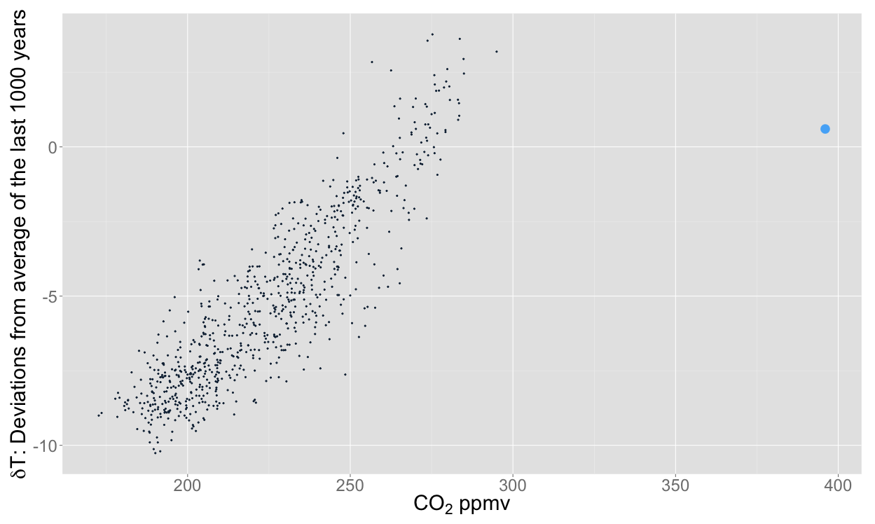
#This is where we add the point for "today"
epica$CO2_ppmv[1] <- 404
epica$Temperature[1] <- 0.6

#We use the flag parameter to make sure "today" is plotted differently to the rest of the data
flag <- seq(0,0,1) #starts a sequence from 0 to 0 in steps of 1

epica_colour <- data.frame(epica, flag)

epica_colour$flag[1] <- 1 #the first row under the flag column is now 1

epica_plot <- ggplot(epica_colour, aes(x=CO2_ppmv, y=Temperature, colour=flag))
epica_plot +
  geom_point(shape=19, aes(size = flag)) +
  ylab(expression(paste(delta, "T: Deviations from average of the last 1000 years"))) +
  xlab(expression(paste(CO[2], " ppmv"))) +
  theme(text = element_text(size=20),
        legend.position="none",
        axis.title.y = element_text(size = rel(1.0)),
        axis.title.x = element_text(size = rel(1.0)),
        plot.background = element_rect(fill = "transparent", colour = NA)
  )
ggsave("EPICA with today - transparent.png", bg = "transparent")
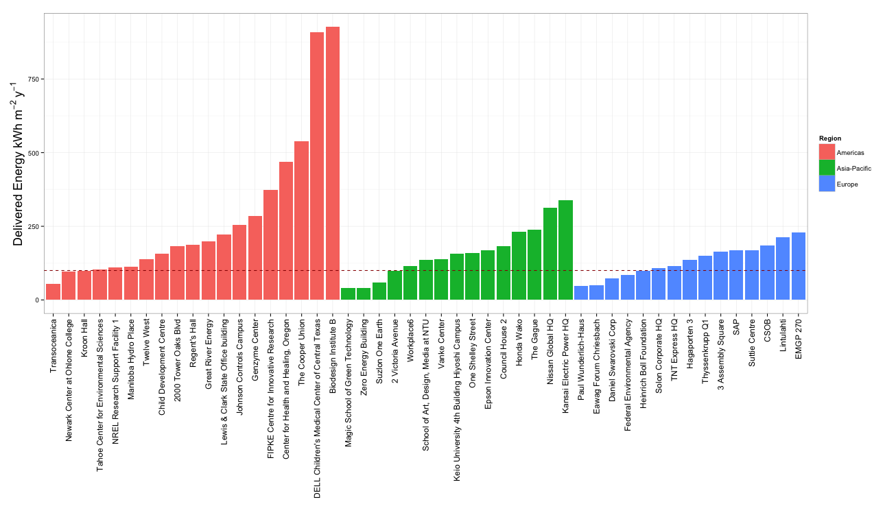
The world's greenest buildings
Yudelson and Meyer's lovely book The world's greenest buildings provides some fascinating insights into how some of the "greenest" buildings in the world actually perform and whether they deliver on their promises. I extracted some basic data from this book to produce the following two graphs.
library(ggplot2)

# Colour blind friendly colours
# The palette with grey:
cbPalette <- c("#999999", "#E69F00", "#56B4E9", "#009E73", "#F0E442", "#0072B2", "#D55E00", "#CC79A7")

GreenBuildings = read.csv("~/Downloads/1.4b Case Study Data.csv", header = TRUE, fill = TRUE)

# produce a bar plot of ranked energy use intensity (kWh/sqm/y) by region
GreenBuildings$Project <- factor(GreenBuildings$Project, levels=GreenBuildings[order(GreenBuildings$Region, GreenBuildings$Delivered.Intensity.KWh.sqm.y), ]$Project) #reorder by grp/value

ggplot(data=GreenBuildings, aes(x=Project, Delivered.Intensity.KWh.sqm.y, fill=Region)) +
  geom_bar(stat="identity") +
  xlab("") +
  ylab(expression(paste("Delivered Energy kWh ", m^-2~y^-1))) +
  geom_hline(aes(yintercept=100), colour="#990000", linetype="dashed")+
  theme_bw() +
  theme(axis.title.y = element_text(size = rel(1.5))) +
  theme(axis.text.x=element_text(size = rel(1.25), angle=90,hjust=1,vjust=0.5))
![]()
# plot ranked energy use intensity (kWh/sqm/y) by type
ggplot(data=GreenBuildings, aes(x=Project, Delivered.Intensity.KWh.sqm.y, fill=Type)) +
  geom_bar(stat="identity") +
  xlab("") +
  ylab(expression(paste("Delivered Energy kWh ", m^-2~y^-1))) +
  geom_hline(aes(yintercept=100), colour="#990000", linetype="dashed")+
  scale_fill_manual(values=cbPalette) +
  theme_bw() +
  theme(axis.title.y = element_text(size = rel(1.5))) +
  theme(axis.text.x=element_text(size = rel(1.25), angle=90,hjust=1,vjust=0.5))
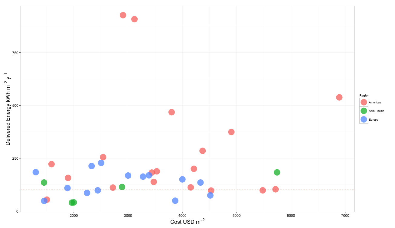
#produce a scatter plot of cost vs eui
ggplot(GreenBuildings, aes(x=Cost.Million.USD*1000000/Total.Area.sqm, y=Delivered.Intensity.KWh.sqm.y, color=Type),legend=TRUE)+
  geom_point(alpha=0.75, size=10)+
  xlab(expression(paste("Cost USD ", m^-2))) +
  ylab(expression(paste("Delivered Energy kWh ", m^-2~y^-1))) +
  geom_hline(aes(yintercept=100), colour="#990000", linetype="dashed")+
  scale_colour_manual(values=cbPalette) +
  theme_bw() +
  theme(axis.title.y = element_text(size = rel(1.5))) +
  theme(axis.title.x = element_text(size = rel(1.5))) +
  theme(axis.text.y = element_text(size = rel(1.25))) +
  theme(axis.text.x = element_text(size = rel(1.25)))
Due to the global nature of the data in the book, I had to convert units as follows:
| Unit in book | Converts to | Unit |
|---|---|---|
| 1 Million BTUs | 293.07 | kWh |
| 1 kBTU | 0.29307 | kWh |
| 1 BTU | 0.00029307 | kWh |
| 1 kWh/sqft | 10.7639104 | kWh.m-2 |
| 1 Therm | 29.3 | kWh |
| 1 cu.m gas | 11.3 | kWh |
| 1 gallons/sq.ft | 40.7 | L.m-2 |
| 1 sqft | 0.09290304 | m2 |
The conversion data I used to generate cost figures are probably out of date, so here they are in case you wan't to make them more current:
| Currency in book | Converts to USD | As of |
|---|---|---|
| 1 CDN | 0.97 | Sep-13 |
| 1 EUR | 1.35 | Sep-13 |
| 1 CHF | 1.11 | Sep-13 |
| 1 GBP | 1.62 | Sep-13 |
| 1 AUD | 0.93 | Sep-13 |
| 1 SGD | 0.8 | Sep-13 |
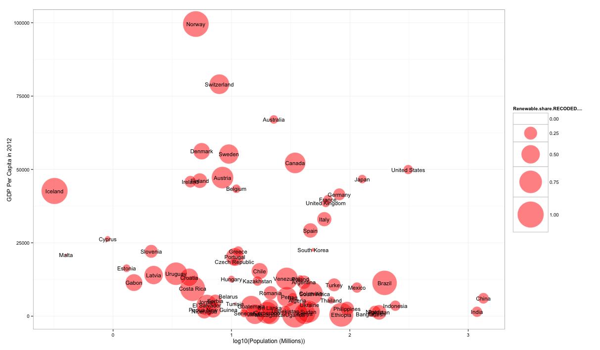
World renewable energy data
The original data for these graphs originated from this website. Navigate to Chapter 3 to find the data I used. Unfortunately, these data, while tabulated, are not easy to extract. You'll probably need to use one of the many free table extractors available on the web.
After cleaning up the data and correcting population data for Norway and Iceland, I got this CSV file. I now wanted to add GDP data to make the plot interesting, which I got from the World Bank. You can use the download data button on that website to get the raw data. I used these data to generate the following graphs:
library(plot2)
library(ggrepel)

GDP = read.csv("~/Downloads/NY.GDP.PCAP.CD_Indicator_MetaData_en_EXCEL.csv", header = TRUE, fill = TRUE)
RE = read.csv("~/Downloads/14e-inventaire-Chap03-3-1.1-Intro - DATA EXTRACT USING TABULA.csv", header = TRUE)

GDPandRE = merge(GDP, RE, by="Country")

names(GDPandRE)[names(GDPandRE)=="GDPandRE$Renewable.share.RECODED...."] <- "RE_share_percent"
names(GDPandRE)[names(GDPandRE)=="Population..Millions."] <- "Population_millions"

radius <- (GDPandRE$RE_share_percent/max(GDPandRE$RE_share_percent))^0.57

symbols(GDPandRE$Population_millions, GDPandRE$X2012, circles=radius, inches=0.8, fg="white", bg="red", xlab="Population (Millions)", ylab="GDP per capita 2012", alpha=0.5)
text(GDPandRE$Population_millions, GDPandRE$X2012, GDPandRE$Country, cex=0.4)


ggplot(GDPandRE, aes(x=log10(Population_millions), y=X2012, size=Renewable.share.RECODED...., label=Country),legend=FALSE)+
  geom_point(colour="white", fill="red", shape=21, alpha = 0.5)+ scale_size_area(max_size = 25)+
  xlab("log10(Population (Millions))")+
  ylab("GDP Per Capita in 2012")+
  geom_text_repel(size=4)+
  theme_bw()

ggsave("Renewables Share vs GDP and Population_2018.pdf",
       width = 45,
       height = 20,
       units = c("cm"))
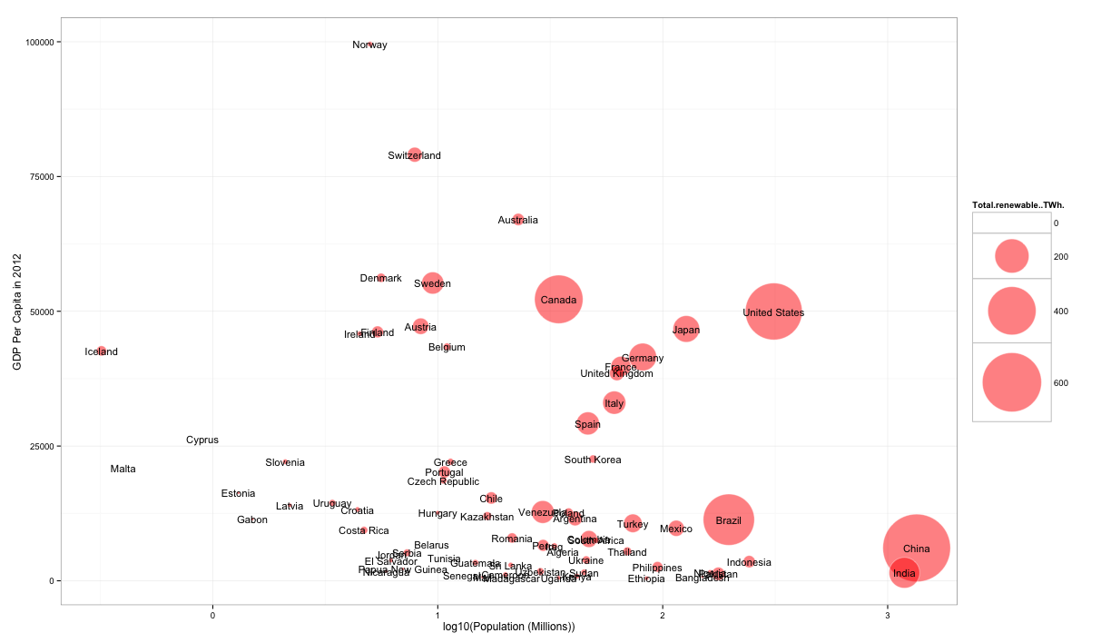
ggplot(GDPandRE, aes(x=log10(Population_millions), y=X2012, size=Total.renewable..TWh., label=Country),legend=FALSE)+
  geom_point(colour="white", fill="red", shape=21, alpha = 0.5)+ scale_size_area(max_size = 35)+
  xlab("log10(Population (Millions))")+
  ylab("GDP Per Capita in 2012")+
  geom_text_repel(size=4)+
  theme_bw()