Be sure to do all exercises and run all completed code cells.
If anything goes wrong, restart the kernel (in the menubar, select Kernel\(\rightarrow\)Restart).
Plotting and Arrays
You have now seen the basic Python language (“syntax”) and programming methods.
These basic building blocks can be built-up to construct advanced programs for things such as:
solving the equations for engineering problems;
simulating the behaviour of constructions and other designs;
optimising structures, energy flows or other problems;
analysing data from measurements in order to present the results.
For the last item you will need some extra tools, including how to plot your results in high-quality figures and how to load your data from files and save the results.
In this section we will learn how to plot professional quality figures and save them for use in reports and presentations.
This section covers 2D plotting in this section but 3D can be seen in the supplementary notes.
General advice on working through these notes:
New functions new methods of manipulating data will be introduced as they are needed.
Keep a file or notebook to make a note of the most useful functions and methods for you to look up when you need them, as it is impossible to remember everything.
For things you use less frequently look them up on the internet or in the manuals by searching for what you want to do and the keywords “Python” or “Matplotlib” along with any other snippets you remember.
Most programmers consult the online guides frequently.
Importing Modules and Accessing Attributes
In order to manipulate numerical data effectively we need to use a new data type called a numerical array.
These can be used more mathematically than lists and behave a little differently.
Arrays and plotting functions are imported from external libraries, in the same way we have already seen for the math and numpy libraries.
Matplotlib
Matplotlib, and particularly its plotting capabilities in pyplot, are used to create publication quality figures of functions and data. The functionality is vast, and you will need to refer to the documentation frequently until you are familiar with what you need from it and the details of how it is used:
https://matplotlib.org/stable/tutorials/introductory/usage.html.
Most of the functionality we will be using are contained in the pyplot functionality of Matplotlib, which is normally accessed using:
import matplotlib.pyplot as plt
The various plotting tools and ways of specifying figure attributes are then accessed using the syntax:
plt.ATTRIBUTE(ARGUMENTS)
The Basics of Plotting
In its simplest terms the plot() function in pyplot takes a list of \(x\) values and plots each one on the \(x-\)axis against a corresponding \(y-\)value from a list of \(y\) values of the same length.
This is demonstrated for the squares of \(x=[1,2,3,4]\) below:
import matplotlib.pyplot as plt

xvals = [1, 2, 3, 4]
yvals = [1, 4, 9, 16]

plt.plot(xvals, yvals)

plt.show()
However: there are two main methods of plotting figures, so the online documentation can sometimes be confusing at first.
See the guide here for the alternative way of making figures as used above. Although this may seem simpler at first (and looks like other languages such as MATLAB) the method used below is more flexible and “object oriented”.
Creating a Figure
The plt.subplots function returns two things: a figure canvas to construct a figure on, and a set of axes to draw specific plots on.
The
figobject has.ATTRIBUTESfor changing things such as the figure title, axis labels and decorationsThe
axobject has.ATTRIBUTESsuch as functions for specific plot types etc.
fig, ax = plt.subplots()
Once you have some axes (on a figure) you can start drawing things directly on them.
Example: Square Wave
To plot a “square wave” that switches between the values \(y=+1,-1,+1,-1,\dots\) every \(\pi\) radians:
import matplotlib.pyplot as plt

# create a single set of axes on a figure
fig, ax = plt.subplots()

pi=3.14
xvals = [-2*pi, -pi, -pi, 0, 0, pi, pi, 2*pi]
yvals = [    1,   1,  -1,-1, 1,  1, -1,   -1]

ax.plot(xvals, yvals)

plt.show()
Multiple axes on the same plot
The possible arguments to plt.subplots() are given in the documentation here: https://matplotlib.org/stable/api/_as_gen/matplotlib.pyplot.subplots.html#matplotlib.pyplot.subplots
matplotlib.pyplot.subplots(nrows=1, ncols=1, *, sharex=False,
                  sharey=False, squeeze=True, subplot_kw=None,
                  gridspec_kw=None, **fig_kw)
Of particular interest are the number of rows nrows and columns ncols of axes on the figure.
If you don’t specify there will only be a single set of axes as above, but if you give two values as arguments they stand for the number of rows and number of columns.
The ax object will then be a [list] of axes or a set of axes, depending on how you unpack the returned values:
Try out the following examples below to see what they do
Two rows (one column by default) and the variable ax contains a list of two axes ax[0] and ax[1]
fig, ax = plt.subplots(2)
a 2x2 grid of axes using the variable axs for multiple Axes: axs = [axs[0], axs[1], axs[2], axs[3]]
fig, axs = plt.subplots(2, 2)
Each axis has its own variable name, for multiple Axes, here ax1 and ax2
fig, (ax1, ax2) = plt.subplots(1, 2)
# YOUR CODE HERE
Numpy and Numerical Arrays
Lists are useful but it can be fiddly to perform mathematical operations for each element, e.g.::
b = [3*sin(x)**2+10 for x in a]
Also multiplying a list by a number is interpreted as adding the list to itself that number of times:
alist = [1, 2, 3]
print(alist+alist)
print(alist*3)
[1, 2, 3, 1, 2, 3, 1, 2, 3]```
Another data type can be imported with the Numerical Python (NumPy) module that behave in a more mathematically logical way.
Numpy
NumPy is a Python library that provides efficient operation on arrays of data.
NumPy stores data in what are called numerical arrays, along with many functions for generating and methods for manipulating them.
It is usually imported using the alias np:
import numpy as np
You can then get help by using the help(MODULE.THING) command, for example type:
help(np.random)
To see the help manual on the random functions in NumPy.
Converting Lists to Arrays
An array looks like a list but it is a NumPy N-Dimensional Array (in this case 1D).
NumPy arrays have element-by-element (elementwise) operations, which is more logical mathematically:
import numpy as np

alist = [1, 2, 3, 4]
ary = np.array(alist)

print(ary+ary)
print(ary*ary)
print(ary**3)
Plotting can be done on arrays the same as with lists:
import matplotlib.pyplot as plt
import numpy as np


xvals = np.array([1,2,3,4,5,6,7,8,9,10])
xsquared = xvals**2

fig, (ax1, ax2) = plt.subplots(1, 2)

ax1.plot(xvals, xsquared)
ax2.plot(xvals, np.sqrt(xvals))

fig.show()
NumPy also contains functions that can act directly on all the elements of an array (unlike those in the
mathlibrary`)
Generating Arrays with arange()
NumPy can generate arrays directly using the function arange():
import numpy as np

a = np.arange(1, 8)
print(a)
print(a**2)
The arange function can also use fractional values
The syntax is range(VAR1,VAR2,STEP), where the values created are those between VAR1 and VAR2, including VAR1 but not VAR2:
import numpy as np

a = np.arange(-1, 1, 0.5)

print(a)
Note: the second value is not included in the array, so to get around this the value needs to be slightly above the required end-point.
Exercise: Create an array that goes from -2 to 2 in steps of 0.2 and includes the numbers -2, 0 and 2
# YOUR CODE HERE
Note: Sometimes the arange function returns the values in scientific notation, as above.
This is due to the central value being very close to zero but not quite (due to precision accuracy).
One solution to this is to use the .round() function method built in to arrays:
import numpy as np
a = np.arange(-2, 2.1, 0.2)

print(a.round(1))
Generating Arrays with linspace()
The arange function is useful when we want an array of numbers with a fixed spacing.
However, in some applications we might want an array that starts and ends at fixed values but has a certain number of steps in between.
For this we can use the linspace function from NumPy, which stands for “linear spacing”.
Type help(np.linspace) to read more about it:
import numpy as np
pi = np.pi

a = np.linspace(-pi, pi, 5)
print(a)
This has returned 5 values in total, including both the start value \(-\pi\) and end value \(\pi\).
That is, with x=linspace(a,b,n) \(a \leq x \leq b\) (unlike with x=arange(a,b,dx) where \(a \leq x < b\)).
Both linspace and the previous arange function are very useful when plotting mathematical functions.
Plotting using Arrays
Arrays can be used to generate the \(x\) and \(y\) values for plotting against each other, and the maths on arrays makes it much easier to generate \(y\) values from an array of \(x\) values:
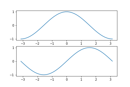
Exercise: Create an array of 100 values from \(-\pi\) to \(\pi\) using linspace() for x-values, create a plot with two axes (two rows and one column), one above the other and plot \(\cos(x)\) on the top ax1 and \(\sin(x)\) on the bottom ax2:
import numpy as np
import matplotlib.pyplot as plt
pi = np.pi
sin = np.sin
cos = np.cos

#xvals = ???
#cosx = ???
#sinx = ???
# YOUR CODE HERE

#create your plot canvas and pair of axes (ax1, ax2) (see examples further up in the notes)
# YOUR CODE HERE

# plot cos(x) on ax1 and sin(x) on ax2
# YOUR CODE HERE

fig.show()
Expected Result:
Changing the Plotting Attributes
Plotting Styles
We can change the plotting style (and many other features) using extra arguments to the subplots and plot functions.
The plot attributes can be given as keyword arguments after the x-values and y-values.
The arguments are given as strings and consist of either a symbol to specify a marker or line type or the colour
(spelled using the American spelling color, without a “u”):
import numpy as np
import matplotlib.pyplot as plt

xvals = np.arange(11)
yvals = xvals**2

# set some x and y dimensions (in inch !!!)
dims = (8,8)
fig, ax = plt.subplots(figsize=dims) # specify the size of the figure

ax.plot(xvals, yvals, linestyle='--', marker='o', color='red')

plt.show()
Use help(ax.plot) to see what else is available and experiment with line styles and points etc.
Also refer to the many online resources for matplotlib as well as the extra cheat-sheet.
help(ax.plot)
Multiple Plots on the same axis
The following example shows that we can plot more than one function on the same graph. A different colour is automatically used for each function.
import numpy as np
import matplotlib.pyplot as plt
pi = np.pi

fig, ax = plt.subplots()

xs = np.linspace(0, 2*pi, 50)
ys = np.sin(xs)
zs = np.cos(xs)

ax.plot(xs, ys)
ax.plot(xs, zs)

plt.show()
Labels and Legends
We next improve the plot by adding labels for the horizontal and vertical axes and we add a legend as well as a title.
Add lines between
ax.plot()andfig.show()to include the following functions:ax.set_xlabel(<TEXT>),ax.set_ylabel(<TEXT>),ax.set_title(<TEXT>)andax.legend().The optional keyword argument
size=12can be used to specify the text size.
The figure should look like the example below the code block.
Use the help() function if you are unsure.
import numpy as np
import matplotlib.pyplot as plt
pi = np.pi


xs = np.linspace(0, 2*pi, 50)
ys = np.sin(xs)
zs = np.cos(xs)

fig, ax = plt.subplots()

ax.plot(xs, ys, label="sin(t)")
ax.plot(xs, zs, label="cos(t)")

# YOUR CODE HERE

fig.show()
help(ax.set_xlabel)
Expected Result: 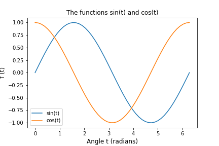
Other features can be changed, such as defining the x and y ranges using the function:
ax.set(xlim=(XMIN, XMAX), ylim=(YMIN, YMAX))
Where XMIN, XMAX, YMIN and YMAX are replaced by values.
The position of the legend can also be specified using one of four built-in position numbers or a pair of numbers in brackets for the relative position on the plot. Other options are available such as "best", which can be found in the help manual.
Copy the code from above to the cell below and use the
ax.set()function to limit the range to \(0\leq x \leq\pi\) and \(0 \leq y \leq 1\)Also use the
loc=(XPOS,YPOS)argument inlegend()to specify the legend position relative to the axes. (You may need to experiment with some values between 0 and 1)Changing the font size can be done individually as above, or for the whole plot using the command
plt.rc('font', size=14), which changes the “resource configuration” for matplotlib generally.
import numpy as np
import matplotlib.pyplot as plt
pi = np.pi
plt.rc('font', size=12)

# YOUR CODE HERE

fig.show()
Expected Result: 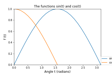
Saving Figures to a File on Your Hard Drive
fig.savefig('FILENAME.extension') saves the figure to a file named FILENAME with the image format given by the .extension: e.g.: .png .jpg .pdf etc.
note this must come before
fig.show()in your scripts, asshow()clears the palette and results in a blank figure being saved if it appears above anything. DO NOT PUT Ashow()function before any other commands (includingsavefig()) as it blanks the canvas when finished!
# run the code above (or paste it here) before running this cell

plt.savefig('sinusoids.png')
Finding your figures on your computer:
The last line in the above shows the function for saving the figure directly to the working folder. It will be saved in whatever folder you are running the Jupyter notebook from.
Look in the main Jupyterhub browser menu to find the figure (or use a file-browser on your own computer).
You can also specify relative folders (if they exist) such as:
# save in a subfolder called Figures (if it exists):
plt.savefig('Figures/my_figure.png')

# save to the folder *above* the one containing the Notebook:
plt.savefig('../my_figure.png')

# save to a folder **inside** the one above the working folder (if it exists):
plt.savefig('../Pictures/my_figure.png')
The rest of this section consists of useful practical examples for you to work through and think about.
There are far too many features to remember them all, so use the online (and other) help as much as possible and keep a note book of the ones you find most useful.
DO NOT PUT A show() function before any other commands (including savefig()) as it blanks the canvas when finished!
Filled Charts and Plots
The following examples show how to draw filled areas such as pie charts and bar graphs, as well as more complicated things such as approximate areas under curves.
Look at the help and online guides and try to improve the figures and use them for your own data.
Pie Charts
Look at the code below for plotting a pie chart and also in the other documentation (help files and online).
# Pie charts

fig, ax = plt.subplots(figsize=(6, 6))  # make the figure have a square aspect ratio

segs = [1, 3, 4, 7]
explode = [0.2, 0, 0, 0]
labels = ["This", "That", "Other", "Nothing"]

ax.pie(segs, explode, labels)
ax.set_title("Pie charts are bad!\n3D Pie charts are EVIL!")

fig.savefig("LOOK_AT_ME.png") #find this using the browser and open it!
fig.show()
Now see if you can:
Increase the font size;
change the labels to display the percentage of the pie that each segment represents; and
change the colours to yellow, orange, red and purple.
# YOUR CODE HERE
Bar Plots
Bar charts can be created using plt.bar(xvals,yvals,OPTIONS).
fig, ax = plt.subplots(figsize=(6, 6))

xvals = [1,2,3,4,5]
yvals = [2,4,6,5,1]
labels = ["First Thing", "Second", "Third", "Another", "One More"]
faces = ["green", 'red', 'blue', 'orange', 'cyan']
borders = ["black"]*5 # a list repeating the string "black" five times

ax.bar(xvals, yvals, color=faces, edgecolor=borders)
ax.set_xticks([1,2,3,4,5]) # positions of the x labels and tickmarks
ax.set_xticklabels(labels, rotation=45)

fig.show()
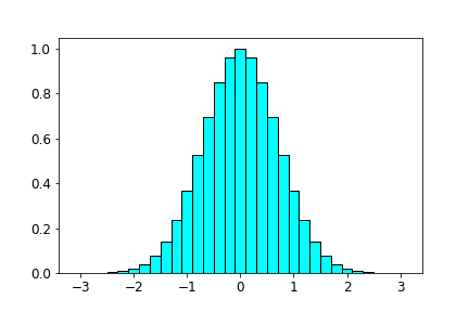
Exercise: Fill in the following code to produce a bar plot that uses np.exp(x) to create \(y=e^{-(x^2)}\) as \(y\) values:
# import what you need
# YOUR CODE HERE

#Approximation to area under a cosine function using bars
#import the usual modules

# set dx to 0.2
# YOUR CODE HERE
# use arange to generate an array for x values between -3 and 3 pi in steps of dx
# YOUR CODE HERE

# let the ys be exp(-xs**2)
# YOUR CODE HERE

# plot a bar plot with the options color='cyan', edgecolor=['black']*len(xvals), width=dx
# YOUR CODE HERE


# show the figure
# YOUR CODE HERE
Expected output:
Task 6
A useful thing to do is to define a function that does all the steps of creating a figure template, so you can apply it to lots of different datasets.
Here you will recreate your own version of the following two-axis figure using the resources listed below.
your figure will not be identical as it is using “random” data
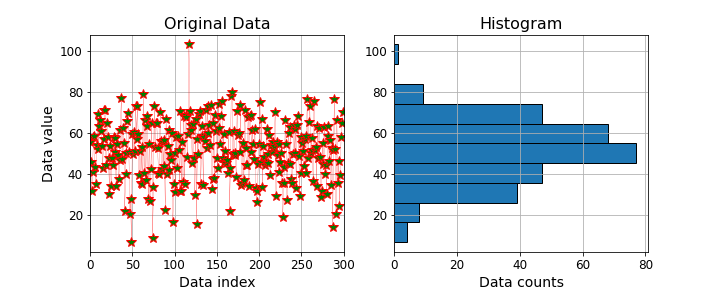
RESTART THE KERNEL before starting this exercise
Complete the function in the cell below that takes some \(x\) and \(y\) data and returns a figure object to display or save, then apply the function to some random data and save it.
The structure is like this:
def plotter(xdata, ydata):
    # 1. your code in a block
    # 2. that creates the figure
    # 3. and edits its properties
    # 4. on both sets of axes
    return fig

##########
# some code to apply ("call") the function
x,y, = #some data
fig = plotter(x,y)
##########

# 5. save the figure to an image in the same folder
Submit BOTH a Python .py script file AND the generated .png PNG image file (NOT A SCREENSHOT and NOT right click “save-as”)
Use the following steps for using the plotting functions and styles:
Import the plotting libraries as
pltMake a figure canvas with one row and two columns of axes
Set the figure with a
figsizeof \(10 \times 4\) inyour two axes will have different names such as
ax1andax2, orax[0]andax[1]
On the first (left) axes you will need to plot the x-data against the y-data
in the
.plot()function you will also need to specify the following optional (keyword) arguments:set the optional keyword argument
linewidth=0.2set the
color=parameter to'red'to adjust the marker colourset the
markeroption to'*'and adust themarkersizeparameter to make them biggerthe
markerfacecolorshould be green
You will need to set the title, x-label and y-label, all with their own
size=??for the fontsuse
<AXNAME>.grid()to put a grid on the axis, where<AXNAME>is replaced with your axes nameSet the limits on the x-axis to match the example data (\(0:300\))
On the second (right hand) axes use the
.hist()function to plot a histogram of only the \(y-\)dataUse the
orientation='horizontal'optional keyword argument to rotate the histogram to align it with the dataOther keyword arguments to experiment with are
edgecolorandlinewidthEnsure that the figure has all the elements in the example
Save the figure using the
.savefig()function at the end of the script (not inside the function).
Self-help
To find out what any of the functions do, use the help function in a new code Cell.
For example, to learn how to use random.normal in NumPy, type:
help(random.normal)
# do NOT change the name of this function
def plotter(xdata, ydata):
    # 1. import the library for plotting
    # YOUR CODE HERE
    plt.rc('font', size=12) # leave this in place, it will change all text to 12 point

    # 2., 3., 4. do all the plotting and style elements in the function code block below
    # starting by creating the figure and axes...
    #fig, ??? = ???
    # YOUR CODE HERE

    # leave this next line in place to return the main figure object
    return fig

###############################################################################
###############################################################################
# YOU DO **NOT** NEED TO CHANGE THIS BLOCK
# the lines in this area make some random data and give it to your function to plot...
import numpy as np

N = 300
xdata = np.arange(N)
mean = 50; std = 15
ydata = np.random.normal(mean, std, N)
#help(np.random.normal)

#your function MUST return a fig object for the following to work
fig = plotter(xdata, ydata)
###############################################################################
###############################################################################


# 5. save the figure to the working folder as a png image, (1% for doing  this)

# YOUR CODE HERE

# => check the saved file looks OK then submit BOTH your task6.py script AND the figure.png to moodle
Feedback cell:
Remember to run the cell above after restarting the KERNEL, then:
Run the cell below (from your
AR10366on Jupyterhub) to get feedback on your plot.Note: this is a new and quite complicated checking script:
it may not detect every problem;
it may throw errors when there is nothing really wrong.
Please let me know if this is the case.
Use your own judgment on if the plot looks good quality.
import sys
sys.path.append(".checks")
import check06

try: check06.test(plotter)
except NameError as e: print(str(e)+"\nYou need to run the cell above to define the plotter function")
Further Material: Creating Multiple Plots using Loops
Loops can be used to create multiple plots without having to type each individually.
This can be useful both when plotting many datasets and also plotting things such as series representations of mathematical functions.
The next example shows the power series that can be used to approximate the function \(\sin(x)\): $\( \sin(x)\approx x - \frac{x^3}{3!} + \frac{x^5}{5!} - \cdots \)$
Use the following example as a template to help build up the exercises below it.
import numpy as np
from math import factorial
import matplotlib.pyplot as plt

fig, ax = plt.subplots()

xs = np.linspace(-np.pi, np.pi, 50)

# plot the real sine function
ax.plot(xs, np.sin(xs), label='sin(x)', linewidth=3, color='black')

ys = 0  # give an initial value for the ys value here, the arrays in the loop will then be added to zero
p = 1
for i in [1, 2, 3]:
    n = 2*i-1
    ys = ys + p*xs**n / factorial(n) #try printing ys each time to see how they change
    ax.plot(xs, ys, label=f"{n} terms")
    p = -p  # this value alternates between positive and negative

ax.set( xlim=(-np.pi, np.pi), ylim=(-3, 3) )
ax.legend(loc=(0.15, 0.6))


plt.savefig('more_sinusoids.png')
Exercise: Fourier Series
A Fourier Sine Series is an infinite series made up of sine or cosine terms.
An example is the approximation to a “square wave” that switches between the values \(y=+1,-1,+1,-1,\dots\) every \(x=n\pi\) (\(n=1,2,3,\dots\)).
The square wave in Exercise 1 can be approximated as the Fourier Series:
with the coefficients \(a_1=1\), \(a_3=1/3\), \(a_5=1/5\), … \(a_n=1/n^2\).
Plotting the component functions
Use the template below to make a script for plotting the individual terms for the series.
You will expand on this later to plot the resulting series with increasing numbers of terms.
#import both the NumPy and plotting modules
# YOUR CODE HERE

#use linspace to generate a 50 element array between 0 and pi for the x values
# YOUR CODE HERE

# initialise the figure
# YOUR CODE HERE


#use a FOR loop to assign the values 1, 3 and 5 to a variable n
# YOUR CODE HERE
    #define a coefficient a to be the value 1.0/n
    # YOUR CODE HERE

    #calculate the y values as a*sin(n*xvalues)
    # YOUR CODE HERE

    #plot the x-values against the y-values
    #  - use the following for the label: label=f'1/{n} sin({n}x)')
    #  - (try to break this down to think about how it works)
    # YOUR CODE HERE

# create a legend and show the figure
# YOUR CODE HERE
Expected Output: 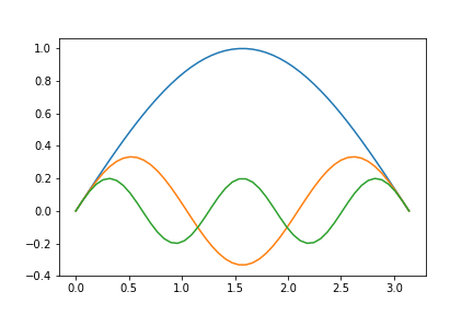
Summing the Terms
We will now sum the terms in the series to see how the function starts to build up.
Simply copy your code from the problem above into a new code Cell and change the following aspects:
#import both the NumPy and plotting modules
# YOUR CODE HERE

#use linspace to generate a 50 element array between 0 and pi for the x values
# YOUR CODE HERE

# initialise the figure
# YOUR CODE HERE

#before the loop set an initial y-values of zero (see the power-series example)
# YOUR CODE HERE

#use the line below to set an "empty" label to add information to on each iteration:
lbl=''

#use a FOR loop to assign the values 1, 3 and 5 to a variable n
# YOUR CODE HERE
    # inside the loop...
    #define a coefficient a to be the value 1.0/n
    # YOUR CODE HERE

    #change the y-value definition to ADD TO the previous value: yvalues=yvalues+a*sin(n*xs)
    # YOUR CODE HERE

    #use the line below as it is to define the label
    lbl = lbl + f"1/{n} sin({n}x)"

    # plot the x-values against the y-values
    #  - in the plot command set label=lbl
    # YOUR CODE HERE

    #add the following line to put a "plus" after each term...
    lbl = lbl + '+' #why do we add the "+" at this point?


# set the legend and show the figure
ax.legend(loc=(1.01, 0))
fig.show()
Expected Output: 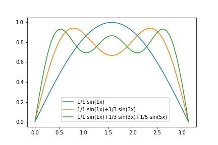
Convergence
Finally, it’s interesting to see how the series will end up after many terms.
import matplotlib.pyplot as plt
import numpy as np

xs = np.linspace(0, np.pi, 50)
ys = 0
i = 0

for n in range(1, 100, 2):
    i = i+1
    a = 1.0/n
    ys = ys+a*np.sin(n*xs)

# move the plot function to OUTSIDE the indented loop code block to only plot the final plot...
plt.plot(xs, ys, label=str(i)+' terms')

plt.legend(loc='best')
plt.show()
Using loops with subplots
Creating a figure using the function subplots(NUMROWS, NUMCOLS, *ARGUMENTS) returns a list of axes:
import matplotlib.pyplot as plt
import numpy as np

xs = np.linspace(-np.pi, np.pi, 50)

fig, ax = plt.subplots(2, 1, figsize=(10,8))  # two rows, one column, start first plot
# ax is a list ax = [ax1, ax2, ax3 ...] accessed using ax[0], ax[1] etc...

# plot to the first set of axes
ax[0].plot(xs, np.sin(xs), color='red', label="sin(x)")

# plot to the second set of axes (bottom row)
ax[1].plot(xs, np.cos(xs), color='blue', label="cos(x)")
ax[1].text(-4, 1.0, "(b)")
ax[1].set_title("Second")
ax[1].legend()

# go back to the first set of axes
ax[0].legend(loc=2)
ax[0].set_title("First")
ax[0].text(-4, 1.0, "(a)")

plt.savefig('subplot1.png')
Loops can be useful to simplify repetition in code:
import matplotlib.pyplot as plt
import numpy as np

xs = np.linspace(-np.pi, np.pi, 50)

funcs = [np.sin, np.cos, np.tan]
cols = ["red", "blue", "green"]
labs = ["sin(x)", "cos(x)", "tan(x)"]
txt = ["(a)", "(b)", "(c)"]

N = len(funcs)

fig, ax = plt.subplots(1, N, figsize=(12,4))  # 1 row, N columns,
# ax is a list ax = [ax1, ax2, ax3 ...] accessed using ax[0], ax[1] etc...

for i in range(N):
    fn = funcs[i]
    # plot to the ith set of axes
    ax[i].plot(xs, fn(xs), color=cols[i], label=labs[i])
    a,b,c,d = ax[i].axis() # extract the axis scaling factors
    ax[i].text(0, d*1.1, txt[i])

fig.legend() # create a legend for the whole figure, not for each axes
plt.show()
You can even do multiple rows and columns, but it starts to get complicated….
Note: that Numpy ND arrays use
array_name[ROWNUM, COLNUM]to access an elementBut nested lists use
list_name[ROWNUM][COLNUM]
from numpy import random as rnd

nrows=3
ncols=2
fig, ax = plt.subplots(nrows, ncols, figsize=(12, 9))
# ax is a 2D array ax = [[ax1, ax2], [ax3 ...], ] accessed using ax[0, 0], ax[0, 1] etc...

#define the marker symbols to use in each plot
ms = [["o", "*"],
      [">", "<"],
      [".", "p"]]

# loop though all the axes indices (len(ax)=6)
for i in range(nrows):
    for j in range(ncols):
        # generate lists of 100 randomly drawn floats between 0 and 1
        xdata = rnd.random(100)
        ydata = rnd.random(100)

        aij = ax[i,j]
        aij.plot(xdata, ydata, marker=ms[i][j], linestyle="")
        aij.text(0.4, 0.5, f"{i},{j}", size=50)
        aij.axis([0,1, 0,1]) # another way of scaling the axis dimensions to [xmin, xmax, ymin, ymax]

plt.savefig('subplot_from_list.png')