Frequency Response Measurements
Introduction
This practical exercise is intended to introduce you to measuring and displaying the frequency response and cut-off frequencies of a bandpass filter.
You will use Microsoft Excel to plot the magnitude part of the frequency response for the filter. Note that a frequency response should also include the phase response, but only the magnitude or gain variation is investigated.
All measurements used to construct the graphs should be recorded.
All the theory that you will require to do this laboratory is presented within these notes and is supported by the preceding CT6 notes.
Band Pass filter cut-off frequencies and bandwidth
The band-pass filter circuit shown in comprises a high-pass RC-filter followed by a low-pass filter (i.e., connected in cascade with).
The loading effect of the low-pass filter on the high-pass filter is minimised by using resistors and capacitors in the low-pass filter which have at least an order of magnitude (i.e., $\times 10$) higher impedance than in the high-pass filter. Therefore, the upper and lower cut-off frequencies, and the bandwidth of the filter, may be estimated quite well using the equations in the table below. The resistor and capacitor values are given in the circuits immediately above the equations. To improve the accuracy of the high-pass filter cut-off frequency estimation, you should include the 50$\Omega$ waveform generator output resistance RS as shown below, since 50$\Omega$ is a significantly higher proportion of 560$\Omega$ than 5.6k$\Omega$. Please do not list wire resistance when explaining sources of error; its effect is truly negligible.
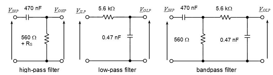
| High-pass filter | Low-pass filter | Band-pass filter |
|---|---|---|
| Cut-off frequency, \(f_{c1} = \frac{1}{2\pi \left ( R + R_s\right) C}\) | Cut-off frequency, $f_{c2} = \frac{1}{2 \pi R C}$ | Lower cut-off $f_{c1}$ |
| Upper cut-off $f_{c2}$ | ||
| Band-width $f_{c2} - f_{c1}$ |
Exercise 1
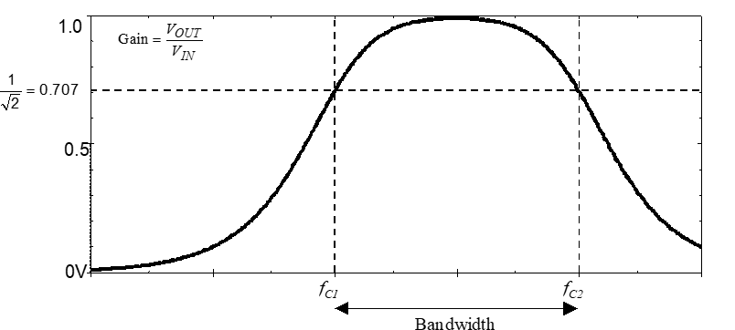
The bandpass filter shown in will have a frequency response similar to that shown in . Calculate the approximate values of the upper and lower cut-off frequencies and the bandwidth for the band-pass filter shown in , using the equations in the table above.
- Lower cut-off frequency $f_{c1} =$
- Upper cut-off frequency $f_{c2} =$
- Bandwidth $f_{c2} - f_{c1} =$
Band-pass filter frequency response measurements
Connect the circuit shown in using the breadboard, R and C components, waveform generator and digital multimeter (DMM) provided in the laboratory.
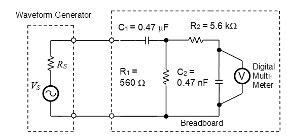
Set the DMM to measure the rms value of AC voltage by pressing the AC V front-panel key.
Set the waveform generator so that it displays the internal voltage before its 50 $\Omega$ source resistance i.e., operates in High Z mode, rather than the terminal voltage after the 50 $\Omega$ source resistance, by executing the appropriate key sequence. For older models this is:
- Blue Shift followed by MENU gives A: MOD MENU;
- Right arrow to SYS MENU;
- Down arrow to OUT TERM;
- Down arrow to get 50 OHM (if already in HIGH Z state press ENTER key to escape);
- Right arrow allows you to change to HIGH Z;
- Press ENTER key. Set the waveform generator to produce a 1.000 V rms, 5 kHz sine wave output.
The DMM should give a reading close to 1.000, e.g., 0.900 V.
A 5 kHz signal will lie within the passband of the filter, and therefore the filter gain, $\frac{V_{\text{out}}}{\text{in}}$, should be approximately equal to 1. If the DMM reading is not close to the waveform-generator setting, check that you have set the output to be 1V rms, and not a 1 V pp.
Since the waveform generator output remains constant at 1V rms when the sine-wave frequency is varied, the magnitude (or gain) response of the filter may be plotted by simply plotting the filter output voltage on a linear or log frequency horizontal axis. In other words, $\text{Gain} = \frac{V_{\text{out}}}{\text{in}}$ but since $\text{in} = 1V$, $\text{Gain} = \frac{V_{\text{out}}}{1} = V_{\text{out}}$.
Exercise 2
Measure and record the output voltage $V_{\text{out}}$ (i.e., gain) of the filter over the frequency range 100 Hz to 300 kHz, i.e., over 3+ decades of frequency variation.
To do this open a Microsoft Excel worksheet and add the column headings and frequencies shown below.
Vary the waveform-generator sine-wave frequency by using direct number entry and enter your output voltage values, i.e., filter magnitude response or gain values, in the spreadsheet cells adjacent to the set frequency.
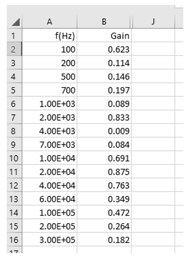
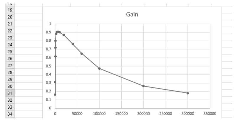
Once the measurement values have all been entered, click and drag to highlight rows 1 to 16 in columns A and B. Select Recommended Charts in the top Excel toolbar. Select the recommended chart closest to the form below which corresponds to a graph of Gain versus frequency.
Exercise 3
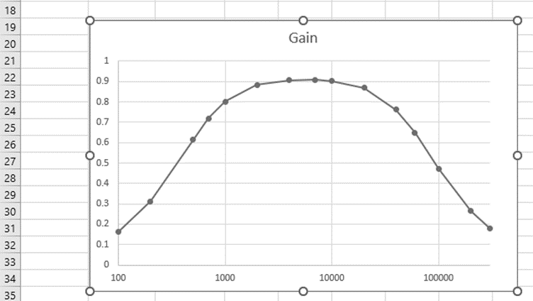
This graph presentation is generally not satisfactory when sweeping a quantity over several decades of value variation. Why and how could the graph display be improved? This problem was previously identified and resolved in the Maximum Power Simulation lab.
Change the presentation of the graph to better show the variation in filter gain over several decades of frequency variation using the process below.
Right click on the graph’s horizontal axis, select Format Axis and choose Logarithmic scale for the horizontal axis so that the graph changes to the form shown below. Also, Change the Minimum and Maximum bounds to correspond to 100 and 3e5 Hz, respectively to better fit the measured data over the full width of the graph window.
Exercise 4
The lower and upper cut-off frequencies, $f_{c1}$ and $f_{c2}$, respectively, lie at the half-power points where $\left ( \frac{V_{\text{out}}}{\text{in}} \right ) ^ 2 = \frac{1}{2}$, or where is $\frac{V_{\text{out}}}{V_{OUT-MAX}} = \frac{1}{\sqrt{2}} \approx 0.707 $. Measure and record the cut-off-frequency values precisely by adjusting the waveform-generator frequency until the filter output voltage is equal to 0.707 times the maximum passband gain you measured. For example, if this was 0.900, the half-power points or cut-off frequency values will lie at $0.707 \times 0.900 = 0.636$. Use these to estimate the practical filter bandwidth.
\[f_{c1} = \qquad Hz , \qquad f_{c2} = \qquad Hz , \qquad f_{BW} = \qquad Hz\]Explain any differences between the calculated cut-off frequencies and the measured values.
Can the magnitude response be better displayed to show upper and lower cut-off frequencies and bandwidth?
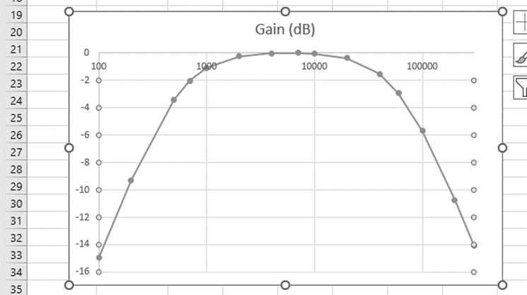
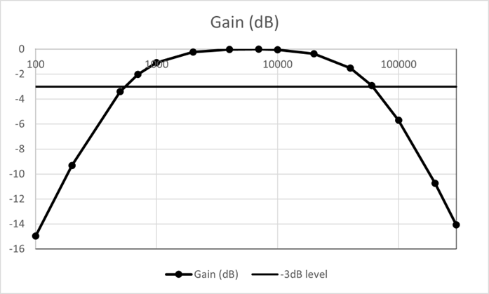
Add a Gain (dB) column in column C of your spreadsheet using the following process. It will then be easier to identify the cut-off frequency point on a new normalised-gain graph, since these will lie -3dB down from the 0dB axis where the linear gain value is $\frac{1}{\sqrt{2}}$. Note the $20 \log \left ( \frac{1}{\sqrt{2}} \right ) = -3dB$.
In the second row/cell of the Gain (dB) column add an equation to calculate the gain in dB but also normalise the gain to give a maximum value of 1 or 0dB dividing gains by your highest value of passband gain. For example, if the maximum passband gain is 0.900, add =20*LOG10(B2/0.900) to compute the normalised gain in dB. Copy this cell, then highlight the rest of the cells and paste the copied cell into all other cells to compute all gains in dB.
Hide column B in your spreadsheet by right clicking the B column label and selecting Hide. Highlight columns A and C, select Insert and Recommended Chart and select the graph type shown below.

Right click the top horizontal axis to select Format Axis and select Logarithmic Scale, Change the boundary values to 100 and 300k Hz to give a Bode plot as below. Also, Change the Minimum and Maximum bounds to correspond to 100 and 3e5 Hz, respectively, to better fit the measured data to the graph window.
Add a ‘-3dB level to the Bode plot so that you check your cut-off frequency calculations in Exercise 1. Note, you will need to include an apostrophe in the column ‘-3dB label to avoid the label being interpreted as an equation.
Click and drag to highlight rows 1 to 16 in columns A, C and D and select Recommended Charts in the top Excel toolbar. Select the recommended chart closest to the form below, i.e., a graph of Gain versus frequency.
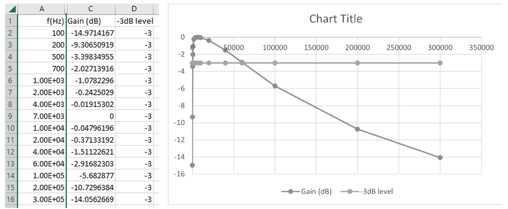
Right click the horizontal axis to select Format Axis/Logarithmic scale. Right click graph middle to select. Format Plot Area menus. Click on the -3dB line and change the marker option to No fill and No line to create a Bode diagram similar to that below. The points of intersection correspond to the cut-off or break frequencies of the filter.
Once each cut-off frequency has been found, it is useful to note that only 2 or 3 measurements above and below these are required, and the frequency response may be plotted from relative few measurements, e.g., using $0.1f_c, \, 0.2f_c, \, 0.5f_c \text{ and } f_c, \, 2f_c, \, 5f_c \text{ and } 10f_c $. Therefore, a Bode plot allows the magnitude graph to be plotted with relatively few frequency measurements e.g., the plot below is drawn using 11 measurements, rather than 16 previously used.
Exercise 5
Disconnect the low-pass filter. Set the waveform generator frequency to 10 kHz and record VOUT which corresponds to the passband gain.
\[\text{Gain} \vert _{10 kHz} = \qquad\]Therefore cut-off frequency gain is
\[\text{Gain} \vert _{fc} = 0.707 \times \text{Gain} \vert _{10 kHz} =\]By precisely adjusting the waveform-generator frequency until the filter output voltage is equal to 0.707 times the pass-band level, e.g., $0.707 \times \text{Gain} \vert _{10kHz}$, measure and record the high-pass filter cut-off frequency, $f_C$.
Explain any difference between this measured $f_C$ and the corresponding value calculated in Exercise 1.
Use the measured value to calculate the frequencies in the table below. Measure and record $V_{\text{out}}$, and hence the filter Gain, at each frequency, and enter in Excel.
Normalise the Gain values as previously illustrated with revised B2 and 0.900 values, e.g., =20*LOG10(B2/0.900) Use a new Excel file to create a Bode plot for the high pass filter.
Sketch the Bode plot and explain whether the number of frequency samples used should be increased or decreased, and how, to adequately shows the filter magnitude part of the frequency response.
When plotting and presenting experimental results, is it a good idea to highlight the measured values with markers, as Excel does, or just show the variation without markers? Explain your answer.
| $f$ (normalised) | $f$ (Hz) | Gain ($= V_{\text{out}}$) | Gain (dB) |
|---|---|---|---|
| $0.1 \times f_c$ | |||
| $0.2 \times f_c$ | |||
| $0.5 \times f_c$ | |||
| $1.0 \times f_c$ | |||
| $2.0 \times f_c$ | |||
| $5.0 \times f_c$ | |||
| $10.0 \times f_c$ |
Low pass filter frequency response measurements
Exercise 6
Disconnect the high-pass filter and connect the low-pass filter alone. Set the waveform generator frequency to 1 kHz and record VOUT which should correspond to the passband gain.
\[\text{Gain} \vert _{10 kHz} = \qquad\]Therefore cut-off frequency gain is
\[\text{Gain} \vert _{fc} = 0.707 \times \text{Gain} \vert _{10 kHz} =\]By precisely adjusting the waveform-generator frequency until the filter output voltage is equal to 0.707 times the pass-band level, e.g., $0.707 \times \text{Gain} \vert _{10kHz}$, measure and record the high-pass filter cut-off frequency, $f_C$.
Explain any difference between this measured $f_C$ and the corresponding value calculated in Exercise 1.
Use the measured value to calculate the frequencies in the table below. Measure and record $V_{\text{out}}$, and hence the filter Gain, at each frequency, and enter in Excel.
Normalise the Gain values as previously illustrated with revised B2 and 0.900 values, e.g., =20*LOG10(B2/0.900) Use a new Excel file to create a Bode plot for the high pass filter.
Sketch the Bode plot and explain whether the number of frequency samples used should be increased or decreased, and how, to adequately shows the filter magnitude part of the frequency response.
When plotting and presenting experimental results, is it a good idea to highlight the measured values with markers, as Excel does, or just show the variation without markers? Explain your answer.
| $f$ (normalised) | $f$ (Hz) | Gain ($= V_{\text{out}}$) | Gain (dB) |
|---|---|---|---|
| $0.1 \times f_c$ | |||
| $0.2 \times f_c$ | |||
| $0.5 \times f_c$ | |||
| $1.0 \times f_c$ | |||
| $2.0 \times f_c$ | |||
| $5.0 \times f_c$ | |||
| $10.0 \times f_c$ |
Reflection on skills and learning
Complete outside the lab if you run out of time in your lab notebook. Comment on your individual attainment as suggested below. What percentage of the lab work did you complete? How do you rate your participation as a lab group member?
What level of proficiency do you feel you achieved in experimentally measuring the frequency response of a practical filter circuit and plotting and displaying the magnitude part of the frequency response using Excel. Choose one of the following and add a comment.
- High –very confident measuring the practical filter circuit and entering, plotting and manipulation the plot display via Excel to ease interpretation. Potential applications could be —-?
- Medium – some further practice required but attained reasonable competence in measuring and plot-ting frequency response results. More practise is especially required in —-?
- Basic – Seemed to take longer than average to successfully measure, plot and manipulate the display of the results. Need significantly more practice in —-?
List two or more ways in which attending and completing the lab work has been of value.
List any suggested changes to the lab work that you identified which would facilitate circuit theory learning and acquiring skills.