Johnson, P. & Nemetz, F. (1998), Towards Principles for
the Design and Evaluation of Multimedia Systems, in H. Johnson, L. Nigay & C. Roast(eds.), People and Computers XIII (Proceedings of the HCI’98),
Springer-Verlag, pp. 255-271.
Towards Principles for the Design and
Evaluation of Multimedia Systems
Peter Johnson & Fabio Nemetz
Department of Computer Science, Queen Mary and
Westfield College, University of London, Mile End Road,
London, E1 4NS, UK
Tel: +44 171 975 5224
Fax: +44 181 980 6533
E-mail: {pete,fabio}@dcs.qmw.ac.uk
URL: http://www.dcs.qmw.ac.uk/
The rapid growth of multimedia technology has made it possible to deliver high quality audio, graphics, video and animation to the user. However, this growth in technology has not been met by a growth in design knowledge. While it is possible to have multimedia it is not at all obvious that we know how to design high-quality multimedia systems that are fully usable to the degree we should expect. To improve the situation much work is under way to develop guidelines, style guides and principles for multimedia design. This paper illustrates the problem facing designers (and users) of multimedia systems by examining some of the design mistakes that have been made in one public information system (as an example of one class of multimedia systems). We then consider what design features any such principles should address.
Keywords: multimedia system
design, evaluation of multimedia systems, principles for multimedia design.
1 Introduction
Multimedia technology can considerably increase the options open to the user-interface designer (Alty, 1997). However, the lack of detailed design knowledge and widely available design experience make multimedia user-interface design and evaluation ill-defined and unprincipled activities.
Although many view multimedia just as the use of more than one medium to present information to users (Nielsen, 1995), multimedia is much more than this. In our research, we adopt a wider definition, encompassing both input and output media and focusing on human-computer interaction rather than on the technological aspects. In this way, we consider interactions with animations, gesture recognition, speech input, speech synthesis, haptic input and output and virtual reality as examples or special cases of multimedia. As Marmolin (1991) states:
“A user centred definition would characterise multimedia systems as systems enabling the usage of multiple sensory modalities and multiple channels of the same or different modality (for example both ears, both hands etc.), and as systems enabling one user to perform several tasks at the same time. That is, multimedia is viewed as a multisensory, multichannel, multitasking and multi-user approach to system design. In addition multimedia systems put the user in control, i.e. could be described as a user centred approach” (Marmolin, 1991).
Traditional approaches to design for usability from Human-Computer Interaction do not yet directly deal with the unique characteristics of multimedia systems: “while general usability criteria such as learnability, flexibility and robustness apply equally to single media and multimedia systems, they have little to say regarding the specific benefits and drawbacks of concurrent media input and output” (Bearne et al., 1994).
The use of multiple media, when well exploited by designers, potentially makes multimedia interfaces more exciting, more natural, more enjoyable and pleasant to use than traditional mainly text-based interfaces (Petersen, 1996). This occurs because multimedia provides us with richer forms of representing information in human-computer interactions. However, it does not necessarily follow that merely by increasing the richness of the media we will increase the utility and usability of information and computer systems. While in some cases the addition of more media will allow us to express concepts and information more fully, with greater clarity, and with greater accuracy than before, in other cases it will introduce ambiguity, confusion and contradiction.
Our research aims to define a set of principles to address the complexities of multimedia design and evaluation, in order to make multimedia systems useful and usable, rather than “gimmicky” and ephemeral. The background theory involves research in cognitive psychology and media communication. Some issues that are under investigation by various researchers (Barnard & May (1994), Bearne et al. (1994), Williams (1996), Faraday & Sutcliffe (1996), Alty (1997), and many others) include:
·
the
effect of media on human cognition;
·
criteria
for selection and combination of different media;
·
how
to identify and incorporate multimedia needs in usability requirements;
·
how
to design interactions involving multimedia;
·
how
to evaluate the effects of media in terms of utility and usability.
The principles that will emerge from our research are expected to support designers in making decisions about the various media so as to maximise the effectiveness and efficiency of the user-computer interactions. This will enable designers to build more usable multimedia systems, and help move HCI towards a stronger theoretical basis and more principled discipline of design.
In the next section, we present examples of the problem with multimedia systems. In section three, a set of multimedia features are presented which need to be considered in the development of multimedia design principles. Then, we discuss the basic steps involved in the continuation of this research. Finally, some conclusions about principles and features of multimedia design are drawn.
2 Is There a Problem with Multimedia Design?
It is all very well for us to argue that we need principles and the like to support the design of multimedia systems, but if it is the case that designers of such systems are getting it right without any such principles then we should not be over concerned. We have carried out an analysis of several classes of multimedia systems and from this we have arrived at the conclusion that there is indeed a problem. The classes of multimedia systems we have considered are not exhaustive but represent different types. We have considered applications on the world-wide web that provide information and guidance in a domain. Examples of these are guides such as tourist guides and the home page for the BCS HCI conference itself. This class of information is designed to let the user find particular information and to “browse” through the information that is there. One example of a relatively good design we have come across of a web-based tourist guide is the Scotguide (http://www.scotourist.org.uk/contents.htm). First we consider this example.
This guide is a realistic and highly interesting public information system that is widely used. It is not chosen as being a really bad example of an information system or as one that has made outrageous use of multimedia. However, when we looked closely at the design of this system we quickly found some interesting features that exemplify the lack of design principles that seems to surround the use of multimedia. The system in question makes use of text, diagrams, maps, photographs, animation and hypermedia. In figures 1, 2, 3 & 4 we show four examples taken from this system. These examples are a good reflection of the whole system, and the problems, which we illustrate here, are found throughout the particular design.
In figure 1 we have shown part of the contents page to the guide. The page is well laid out and is very well designed in terms of the readability of the text and the structure of the information on it. However, the first point to make is the use that is made of animation on this page. It is not possible for us to show this in the figure but we will attempt to describe it. There are two uses of animation on this page. First, the compass in the top-left hand corner of the figure has a lid on it that opens and closes independent of the user doing anything. Second, the star-like compass points alongside the text rotate all by themselves without the user doing anything to them. Neither of these uses of animation have any function in the user interface other than perhaps to make the design more attractive. However, they have a detrimental effect on aspects of the system's usability. The compass has text written around the edges of it (this text is as follows: at the north point -“the guide”, at the east point - “website plan”, at the south point – “magazine” and to the west point – “winter escapes”). Each of these pieces of text at the four compass points is in fact a hypertext link to other pages of information. This was not apparent to us until by chance we moved the mouse pointer over the compass and one of us (not the one using the mouse) noticed a change in the text at the bottom of the Netscape browser. Later we noticed that the cursor had also changed. Just as we had discovered that these compass points were indeed links, the lid of the compass closed shut for only a few moments but enough to make it impossible to read the text and aim the mouse on to a link of interest (in fact we later discovered that you can still select the link even when the lid is closed and you cannot see the text links or the compass points at all). The problem here is that the animated opening and closing of the lid attracts your attention to the compass but then interferes with your ability first to perceive that the text at the four points of the compass are indeed links and, worse still, makes it difficult to select, read and aim at the links with the mouse cursor when (if) you do realise they are links and want to select one of them.
This particular use of animation in multimedia seems to us to break a number of desirable features of design. First, it does not make a significant contribution to the quality or ease with which you can interact with the system nor does it convey any useful information. Second, it actually prevents the user from exploring the system because it obscures, through the animation itself, some of the navigable links of the system.
|
|
|
Figure 1. Scotourist Contents. |
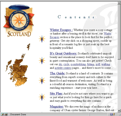
The second use of animation
is on the smaller star-like compass points that are alongside the text in
figure 1. These are one of the first things that the user notices on the page.
They all rotate at the same time and when you view the full page with all its
rotating star-like compass points on it, they become very distracting and
interfere with your reading and searching of the text. The star-like compass
points themselves are selectable buttons that have the same function as the
underlined text links in the adjoining text in figure 1. This redundancy is a good thing as it increases the users' chances of finding
or noticing something. However, the animation of these compass points and the
opening and closing of the lid of the larger compass have a distracting and
interfering effect upon the users' ability to read and select items of interest
from the text. Again, the animation here does not make a significant
contribution to the interaction with or interpretation of the information.
Instead it interferes with and
distracts the user's attention.
Also on this page we would like to draw attention to the map of Scotland that is just below the compass. On this page (figure 1) the map itself is not interactive. On other pages (figures 2, 3 & 4 ) it is. To tell the user this map is now interactive the designers insert text under the map (figure 2) telling the user to “click on a region of the Scottish map for information on that area”. This is fine on the pages where the text appears (as it does on all pages where the map is interactive). However, on the contents page the map looks as if it should be interactive and users do still try to select from it even though the text is not there (and even when they have seen the text previously on other pages).
|
|
|
Figure 2. Scotourist Tour
Contents. |
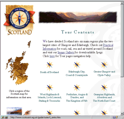
The map presents further problems when it is interactive. In figure 2 it can be seen that the map has regional boundaries on it and these represent different sectors of Scotland that you can gain information about. Good use is made here of redundancy and multiple routes for exploration of the information as further information about these regional areas can be reached from either the map or the rotating compass points (yes they are here again - nine of them this time spinning merrily away). There are nine selectable compass points, eight of these correspond to regions of Scotland and the ninth is labelled “practical information”. A close look at the map gives the impression that there are five regions on the map divided by the boundary lines - where are the other three regions? Well, the Outer Islands constitute a sixth region, and Edinburgh is the seventh and Glasgow the eighth. You cannot identify where the three sectors of the Outer Islands, Edinburgh or Glasgow are and you do not know what the names of the five identifiable sectors are from the map unless you know Scotland. Even then you would have to read the text of the rotating compass points and work out where each of the sectors are on the map. There is clearly a problem with consistency across the two representations and with the quality of the information representation of the map itself.
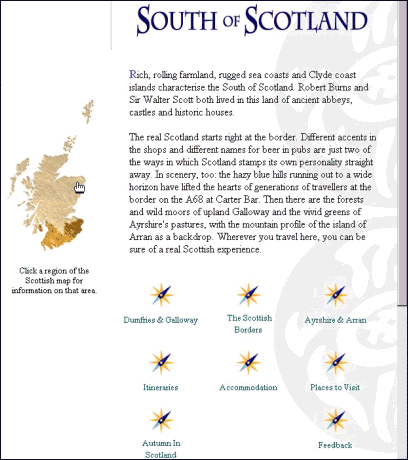
When you select a region from the map you do not get any feedback from the map telling you which region you have selected. When that region is displayed, the map is redrawn with the other regions (the ones not selected) drawn in a lighter shade and with the regional boundary lines hidden (see figure 3). The text below the map tells the user to click on a region of the map (as before) to select a new region but now the regional boundary lines that were there before have disappeared. Worse still, the user cannot make the selection from the hosts of rotating compasses to get to another region because these now relate to features and information about the selected region. At this point the user has to guess where the regions were on the map to select another region with no help at all from the interface. These design problems can be described as failing to maintain a consistent use of redundancy and not consistently allowing multiple routes of exploration.
|
|
|
Figure 3. Scotourist Guide – South of Scotland. |
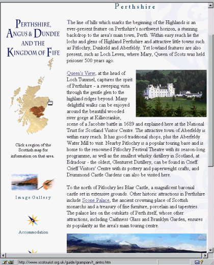
One further problem is shown in figure 4. Here the user has selected the “places to visit” page on one of the regions (Perthshire, Angus & Dundee and the Kingdom of Fife). The user is presented with an attractive display including descriptive text and photographic images. The pictures provide a high quality information representation and a seemingly natural use of this medium. The text contains highlighted places that you can go to for further information about these particular places and alongside and below the selectable places are photographic images (good use of redundancy). The only problem is that the images are not of the places that you can select even though you might think they were. The upper image is of Blair Castle (a non-selectable place mentioned in the text) and Pitlochry (another non-selectable place mentioned in the text). Even worse still, Pitlochry is mentioned in the text before Blair Castle but the pictures are ordered so that Blair Castle is before Pitlochry. Consequently, we have further design problems caused by inconsistencies between the links and the pictures and in the relationship of the pictures to the text content. This lack of referential alignment causes confusion and ambiguity.
|
|
|
Figure 4. Scotourist Guide – Perth. |
To summarise, our brief analysis of this rich and interesting information system has highlighted a number of points at which the system could be improved. We have attempted to stand back from the detail of the particular design problem and characterise these at a more general level of design problem such that we might identify from this analysis some more generally applicable design features. These design features noted are:
· naturalness of the medium
· consistent use of media
· referential alignment
· redundancy
· significant contribution of the media.
· exploration and navigation
· quality of information representation
The two features of consistent use of media and referential alignment are themselves
closely related and can be considered as sub-problems within the allocation of media.
From this brief analysis of a public information system it is clear that there is a need for design principles that can guide designers away from making such mistakes. We would like to stress the fact that this is one of the best public information systems we have found on the world wide web in terms of its information and coverage and yet it clearly has multimedia design problems that detract from the usability of the system. We also hope we have managed to show you something of what a beautiful place Scotland is.
We could go through more examples like this in different areas and uses of multimedia but in the context of this paper we now move on to consider each of the above features from which a set of principles might be usefully developed.
3 From Features Towards Multimedia Design Principles
In this section, each of the features above is considered in a more general context. Each feature is explained and considered together with some further questions it raises. A main source is Alty (1993), who has developed design guidelines for the use of multimedia in process control interfaces. Based on this work and our analysis of design problems we have generalised the features so that they can be used for multimedia in general. We have also augmented the expressiveness of the features, so that they can be further developed to guide design. The ultimate goal is to develop a small set of principles that can be used to aid and guide designers in their reasoning about multimedia systems.
The term principle is used in different ways in the literature. Shneiderman (1997) differentiates three kinds of guidance for designers: high-level theories and models, which offer a framework or language to discuss issues that are application independent, middle-level principles, which are useful in creating and comparing design alternatives, and specific and practical guidelines, which provide reminders of rules uncovered by designers. For instance, one of his middle-level principles is “Use the Eight Golden Rules of Interface Design” which includes eight design recommendations (e.g. enable frequent users to use shortcuts). This agrees with his statement that “the separation between basic principles and more informal guidelines is not a sharp line”. Yet Preece et al. (1994) consider principles as a special case of guidelines. For them, there are two kinds of guidelines: high level guiding principles and low level detailed rules. They consider principles as guidelines that offer high level advice that can be applied widely (e.g. know the user population). On the other hand, principles and rules are considered to be synonyms by Baecker et al. (1995): “collections of statements that advise the designer on how to proceed (e.g., know the user)”, while guidelines are defined as “collections of tests that can be applied to an interface to determine if it is satisfactory (e.g. provide an average response time of less than one second)”.
We take a principle to be some established fact that has a theoretical and empirical basis for its acceptance, that can be applied to a prescribed problem area in a well-defined manner and for which there is some indication of what the result of following the principle (or not) will be. At this stage in our research we identified a number of areas where we believe there is scope for developing a more principled understanding of interacting with multimedia and what features a set of principles for multimedia design must address. These features are developed further below.
3.1 Naturalness
Multimedia systems try to take advantage of human senses to facilitate human-computer interaction, and human-human, computer mediated communication. Considering that we live in a world of multimedia events (Rudnicky, 1992), “many people believe that multimedia communication is natural and corresponds more closely with how the brain has developed” (Alty, 1997), and, therefore, “multimedia exercises the whole mind” (Marmolin, 1991). In this viewpoint, the human brain is seen as having evolved in a multisensory environment, where simultaneous input on different channels was essential for survival. Thus, “the processing of the human brain has been fine-tuned to allow simultaneous sampling and comparison between different channels” (Alty, 1997). Multimedia systems have the potential to make appropriate and efficient use of human perceptual and cognitive capabilities by making our interaction with computers more natural.
A related feature to naturalness is realness or the degree of correspondence between the representation and the real thing. Naturalness and realness are similar but not the same. Naturalness is concerned with the mapping between the stimuli and the senses taking recognition of the fact that people normally gain information from the world from multiple senses (e.g. hearing an explosion would cause people to look for a cloud of smoke or flames). On the other hand, realness is concerned with how close the representation of the explosion corresponds to an actual explosion.
Two consequences for systems that possess these features appear to be that they show properties of believability (the closer they are to the real thing, the more believable they appear to be) and fidelity (the degree of detail).
To fully understand and exploit the naturalness feature, a better understanding of how our senses are affected by each medium and by their combination is needed. Moreover, we need to consider when and to what degree we need to attain particular levels of naturalness and realness in order to support appropriate levels of believability and fidelity. A flight simulator might require high degrees of naturalness and realness in order to effectively train the pilot. The system must be believably like the real thing and be of high fidelity to allow the appropriate levels of flying skills to be developed in the pilot. Similarly, in image guided neurosurgery the surgeon must have high degrees of naturalness and realness in the brain images that are guiding her as she removes a brain tumour. The fidelity and believability of the images are of extreme importance to the success of the operation.
3.2 Media Allocation
How, and on what basis, is a particular medium selected for the presentation of a particular piece of information? Each medium has both constraining and enabling features (Arens et al., 1993) and affords different interactions, offers different communicative intentions and has its own rules and conventions.
But is it enough to have a knowledge of each medium in order to make an adequate selection? Some argue that it also depends on the user’s knowledge and experience of a domain and task: if the domain and task are new to the user, a concrete representation seems to be best; if the user has a lot of experience in the domain and task, then a more abstract form may be adequate - adapted from Marmolin (1991). Alty (1993) adds that the usefulness of different media in presentation situations is closely related to the complexity of the idea being conveyed. He also states that the capabilities of the perceiver play an important role in the media allocation problem.
There is an important difference between “abstract” and “concrete” concepts. Abstract and complex concepts are more easily and completely represented by words than by pictures. In contrast, more concrete concepts, if represented by pictures and sounds, can improve the speed of understanding and comprehension over that of text representation. Moreover, the choice of medium also has to consider what information is intended to be conveyed and what is the intended effect of the information.
It is not easy to define a complete set of criteria to solve the media allocation problem. One aspect that should be investigated in detail is the relation between media and tasks. In other words, the main problem is to determine which media best transmit the information needed by the users to carry out their tasks.
Summarising, it seems that multiple factors play a role in the media allocation decision (Arens et al., 1993):
· Characteristics of the media
· Characteristics of the information
· Goals and characteristics of the user
· Goals of the producer
Based on these factors, it is necessary to determine the enabling and constraining features of each medium, given the goals and characteristics of the user, the intended effect of the information and the characteristics of the information itself. Then, it will be possible to determine the media to be used.
In a training guide for would-be surfers there are several possible ways to show the manoeuvres employed to catch and ride a wave into the shore. In books, pictures or, more commonly, abstract sketches are used. In a multimedia system, real-time video and slow motion video, with annotated text and audio explanations would be used to show the movements of the surfer relative to the oncoming wave, the timing and positioning of the board, the timing and movements as the wave is caught, and then, as the surfer moves from a lying-down to a standing position. Of course, ideally, one would want to use a realistic simulator to enable the user to actually practice the various body movements in differing simulated sea and wave conditions. The instruction guide could match the media to the nature of the information, the goals and skills of the users and purpose of training.
3.3 Redundancy
Often considered useful in complex and cognitively laden tasks, redundancy is considered a significant phenomenon in multimedia systems (Vetere, 1997). It is well known that using both visual and audio channels simultaneously to explain a complex diagram is better than using only one channel; it is also true that people use the redundancy offered by multiple channels to improve their understanding of situations (Alty, 1991). Redundancy is a special case of overlap between channels (Basil, 1994) and it occurs when information in one channel repeats or complements what is said in another channel.
In multimedia systems, redundancy is achieved through the integration and synchronisation of different media. It can produce “real-world” like conditions, and reduce the overload on working memory (e.g. video and audio, animated graphics and text overlay or sound commentary). Comprehension is directly affected by redundancy, since more of the information provided is understood. For instance, if there is confusion and misunderstanding as a result of misperception of information in one medium, then this can be supplemented by providing the same material in another medium, at the same time (or proximal close in time and space). It is through redundancy that we are able to overcome the ambiguity that otherwise could arise in deixis involving pointing and speaking and often eye and head movement, such as in the classic “put that there” phenomenon, in which multiple forms of media are used to overcome the ambiguity of the referents “that” and “there”.
Understanding how effectively to use redundancy, is still a challenge for multimedia systems designers. If combined in a congruent (harmonic, synchronised) way, redundant different media are far more effective than using single media (Hoogeven, 1997). However if combined in a non-congruent way, they are less effective (in this case, disruption, ambiguity and confusion occurs). Vetere (1997) states that presently there is insufficient knowledge to help designers manipulate these redundancies to improve interactions.
Even though redundancy plays a major role in multimedia systems, little is known about how to take full advantage of it. No methodology or criteria for how to apply redundancy in multimedia systems have been developed so far, let alone a theory of redundancy and its effects on usability.
For example, in neurosurgery the surgeon relies upon the redundancy of the many brain images, presented in different media, and located at different positions around the operating theatre as well as on the actual view of the brain through the microscope to keep her aware at all times of the location and intended path of the operation in the brain and to keep her aware of the adjacent parts, to the injured or diseased brain section, that must be avoided at all costs.
3.4 Significant Contribution of the Media
One of the main strengths of multimedia systems is the opportunity for providing richer forms of interaction and information access through the combination of multiple media. To be successful in improving the quality of the interaction and the efficiency of information access, different media must be combined and co-ordinated, otherwise there is a risk of increased complexity and interference to the user from high cognitive and perceptual-motor loadings caused by interaction and information overload (Alty, 1991). Just adding a new medium will not guarantee an improvement in the users’ ability to recognise and understand how to interact with a given system or the meaning of a particular piece of information. Adding extra media can cause the user to not even notice a relevant piece of information due to attentional overload or distraction by another, less relevant piece of information presented in a perceptually dominant medium (Bearne et al., 1994). Hence, additional media should be used only if they make a significant and relevant contribution in the transmission of a message. Otherwise, they can distract and interfere in many ways with the users' ability to perform their tasks.
It is important to observe that this kind of problem also occurs in everyday general communications. Our understanding of multimedia can greatly benefit from theories of communication. Grice’s theory of implicature (Levinson, 1983), for instance, is concerned with the efficient and effective use of language in conversation. One of its maxims, the maxim of quantity, is related to the fact that, when making a contribution to a conversation, this contribution must carry all and only the necessary information, not more and not less than what is required. Another maxim, the maxim of relevance, states that one should make the contributions relevant.
Examples found in the Scottish Tourist guide described earlier clearly introduce animation for no useful reason. It serves to distract the user's attention away from the relevant pieces of information as it is perceptually domineering in the display. Animation could have been usefully used in other ways such as to demonstrate the routes to some of the destinations or to attract the user's attention to relevant parts of the information as in an explanatory guide.
3.5 Exploration
One of the main advantages of multimedia systems seems to be the increased level of interactivity[1] they provide. This is partly due to the use of our senses in a fuller and more orchestrated manner, and also because of a greater flexibility and freedom to explore the information. Ideally, neither the author nor the designer should force how the information should be viewed or processed; the user should be in control, exploring the interface and choosing the best media for the task.
Carroll (1990) has provided a good account of why exploration is a desirable property of a system and its interface. Exploration allows the user to discover for themselves, the workings, content and functional use of a system. Multimedia can be used to facilitate greater exploration in all these areas, but the media have to be designed to support exploration. The ability to support the user in exploration itself has to be designed; it does not just happen.
A high level of interactivity improves sensory stimulation, and thus facilitates human information processing (Hoogeveen, 1997). Alty (1993) adds that, for hidden goals (or goals not well understood), it is better to allow users to exploit the interface and choose the best media for the task. Bearne et al. (1994) suggest, in their usability guidelines for multimedia systems, that users must be given control over the appearance and the disappearance of each piece of information. The feeling of engagement produced by freedom of exploration is an important issue to take into consideration when designing a multimedia system.
One possible explanation for this phenomenon is that we are used to exploring our environment in an active way. Quoting Gibson (1966; 1979) as cited by Hoogeveen (1997), “we do not hear, we listen; we do not see, we look around”. In other words, we actively search for information. That searching is guided by our cognitive understanding of the domain and by our knowledge of how to search. It is also guided by the environment in which we are searching. In the case of multimedia systems, the system is the environment and the designer can provide the support and guidance for searching and exploring. The system must “invite” the user to explore it, enable them to make guesses of what things might do and what they might find, provide feedback to each action taken in the process of exploration, and provide an easy way to reverse or undo any action taken, thus providing a safe and inviting environment for exploration. In the Scottish tourist guide, the exploration aspects of the system could have been improved by allowing the user to easily return from a given location and maintaining consistency in the navigation and interactions available. For example, once having used the “map” to find information about one region, that same map could not subsequently be used to return from that location or to go to another location.
3.6 Quality of Information Representation
It has been argued (Hoogeveen, 1997) that the quality of the representation of multimedia information (e.g. graphic representation/photographic representation) can affect the way people interact with multimedia systems. Each medium has its own rules and conventions and will make its own special demands and requirements upon technology to enable that medium to be used optimally. Although literacy is required in every medium, most computer designers are not well skilled in film or video presentation languages (Alty, 1991). People are used to high-quality productions (such as in films, video or television) and could expect to see something of the same standard in a computer display.
Many current multimedia systems have lower quality audio and video presentation capabilities than a user might find on their TV or hi-fi unit. For many applications the quality of the audio and video is extremely important. However, the acceptable level of quality will vary according to the information being presented, the purpose to which it is to be put and the costs and benefits of providing it at a given level of quality. For example, the quality of audio signal received over a mobile phone is often poor and at times very poor. However, for the purposes of holding a conversation, and given the current costs of producing increased audio quality in mobile phones, it is often acceptable. If though, you were trying to listen (or worse still join in with) a musical quartet over a mobile phone then the audio quality would be inadequate for these purposes. Similarly, in using images, we do not always need high resolution, colour images that update in real-time. However, a neurosurgeon engaged in image-guided surgery would need far higher quality images of the brain than might be required of images of a face in a normal video-conferencing situation (unless of course the video conference was between a patient and a dermatologist trying to assess if the patient’s facial blemish is cause for concern or not).
4 Next steps, small and large
The features presented in this paper were developed from an extensive literature survey and reflect some of the main aspects of multimedia systems. There are of course attempts to develop standards for multimedia design (e.g. Draft Standard for Multimedia User Interface Design ISO/CD 14915-1). This ISO standard includes a number of general principles, namely; suitability for the task, controllability, self-descriptiveness, conformity with user expectations, error tolerance, suitability for individualisation and suitability for learning. It also identifies some specific multimedia design principles, such as suitability for the communication goal, suitability for perception and understanding, suitability for exploration and suitability for engagement. These principles are not out of line with our design features, which we feel ought to be addressed by a set of multimedia design principles. At present the Draft ISO standard is not what we would call principles, but we note that they are still in draft form and it is encouraging that our research and theirs are converging on a common set of features that will result in a set of multimedia design principles. At the present stage, our design features represent a tentative formulation in need of further investigation. In this section, we present our plan for advancing the research.
First we need to refine these features into a set of principles, so that they can be expressed in a more complete and systematic manner, including examples, appropriate theoretical and empirical evidence, and predictions about their effects on usability.
The next step is to assess and refine the principles on different classes of multimedia systems, domains and tasks. In doing this, we will assess their:
1. predictiveness and reliability – through experimental testing; and
2. applicability and usability – through use in design context.
In this way we will be assessing if they apply to multimedia design problems, if they can predict usability issues and be applied to those issues, and if the principles themselves are usable by designers and evaluators to develop and assess the usability of systems using multimedia.
In the end, we should be able to propose evaluation and design methods or techniques that are principle-based. A method of evaluation would include appropriate criteria, forms of data, forms of analysis and techniques of interpretation to produce redesign recommendations. In the even longer term in order to support design creation, environments might be developed, which would include exemplars, guidelines and constraints derived from the principles.
5 Discussion and Conclusion
In this paper, we have showed that we need principles to support the design and evaluation of multimedia systems. Some examples from a system design were described that illustrate there is indeed a design problem. Then we proposed a tentative set of six features that were elaborated with evidences from the literature. The features are:
1. naturalness
2. media allocation
3. redundancy
4. significant contribution of the media
5. exploration
6. quality of information representation
This is an on-going research topic for us. In order to achieve our goals, these features need to be further refined, tested and used in real-world situations before they can emerge as principles for multimedia design.
Multimedia is a typical technological achievement that lacks an appropriate HCI theory basis to enable systematic reasoning about the utility and usability of particular multimedia design options. Without an underlying conceptual development in our understanding of the HCI of multimedia, even using the most advanced technology in design, it will not be possible to improve current designs. Relying upon assumptions, beliefs and intuitions alone will not be enough to bring about a widespread improvement in the quality and usability of multimedia systems.
Our research aims to develop basic principles for the design and evaluation of multimedia systems. We believe that these principles will provide a consistent basis for user-interface designers to make better decisions and, hence, to build more usable and useful multimedia systems.
Acknowledgements
Peter Johnson's research is supported by EPSRC grant numbers: GR/K19211, GR/K79796 and GR/K79154. Fabio Nemetz is funded by CAPES/Brazil. Figures 1 to 4 are copyright of the Scottish Tourist Board.
References
Alty, J. L. (1991), Multimedia - What is it and how do we exploit it?, in D. Diaper & N. Hammond (eds.), People and Computers VI: Usability Now! (Proceedings of HCI’91), Cambridge University Press, pp.31-44.
Alty, J. L. (1993), Multimedia: We Have the Technology but Do We Have the Methodology ?, in H. Maurer (ed.), Proceedings of Euromedia’93, AACE, pp.3-10.
Alty, J.L. (1997), Multimedia, in A. B. Tucker (ed.), The Computer Science and Engineering Handbook, CRC Press, pp. 1551-1570.
Arens, Y., Hovy, E. & Vossers, M. (1993), On The Knowledge Underlying Multimedia Presentations, in M. T. Maybury (ed.), Intelligent Multimedia Interfaces, The MIT Press, pp.280-306.
Baecker, R. M., Grudin, J., Buxton, W. & Greenberg, S. (1995), Human-Computer Interaction: Toward the Year 2000, Morgan Kaufman.
Barnard, P. & May, J. (1994), Interactions with Advanced Graphical Interfaces and the Deployment of Latent human Knowledge, in F. Paterno’ (ed.), Proceedings of the Eurographics Workshop on the Design, Specification and Verification of Interactive Systems, Springer Verlag, pp. 15-48.
Basil, M. D. (1994), “Multiple Resource Theory I: Application to Television Viewing”, Communication Research 21(2), 177-207.
Bearne, M., Jones, S. & Sapsford-Francis, J. (1994), Towards Usability Guidelines for Multimedia Systems, in Proceedings of Multimedia’94, ACM Press, pp.105-110.
Carroll, J. M. (1990) The Nurnberg Funnel: Designing Minimalist Instruction for Practical Computer Skill, MIT Press.
Faraday, P. & Sutcliffe, A. (1996), An Empirical study of Attending and Comprehending Multimedia Presentations, in Proceedings of ACM Multimedia’96, ACM Press, pp.265-75.
Gibson, J. (1966), The Senses Considered as Perceptual Systems, Houghton-Mifflin.
Gibson, J. (1979), The Ecological Approach to Visual Perception, Houghton-Mifflin.
Hoogeven, M. (1997), “Towards a Theory of the Effectiveness of Multimedia Systems”, International Journal of Human Computer Interaction 9(2), 151-68.
Levinson, S. C. (1983), Pragmatics, Cambridge University Press.
Marmolin, H. (1991), Multimedia from the Perspectives of Psychology, in L. Kjelldahl (ed.), Proceedings of the Eurographics Workshop on Multimedia, Springer-Verlag, pp.39-52.
Nielsen, J. (1995), Multimedia and Hypertext –The Internet and Beyond, Academic Press.
Petersen, M. G. (1996) Evaluating Usability of Multimedia Interfaces, Master’s thesis, Department of Computer Science, Queen Mary and Westfield College.
Preece, J., Rogers, Y., Sharp, H., Benyon, D., Holland, S. & Carey, T. (1994), Human-Computer Interaction, Addison-Wesley.
Rudnicky, A. I. (1992),
Introduction to Part II, in M.
Blattner & R. M. Dannemberg (eds.), Multimedia
Interface Design, ACM Press, pp.147-82.
Shneiderman, B. (1997), Designing the User Interface: Strategies for Effective Human-Computer Interaction, third edition, Addison-Wesley.
Vetere, F. (1997), Redundancy in Multimedia Systems, in S. Howard & G. K. Lindgaard (eds.), Human-Computer Interaction - INTERACT’97: Proceedings of the Fifth IFIP Conference on Human-Computer Interaction, Chapman & Hall, pp.205-11.
Williams, D. (1996), Multimedia, Mental Models and Complex Tasks, in G. van der Veer & B. Nardi (eds.), Proceedings of CHI’96: Human Factors in Computing Systems, ACM Press, pp.65-6.